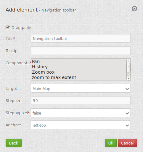
Navigation Toolbar (Zoombar)
The Navigation Toolbar element provides a control to pan and zoom, similar to the OpenLayers PanZoomBar control.

Configuration

- Draggable: element is draggable or not, default true.
- Title: Title of the element. The title will be listed in “Layouts” and allows to distinguish between different buttons. It will be indicated if “Show label” is activated.
- Tooltip: text to use as tooltip.
- Components: components of the navigation toolbar, default all selected.
- Target: Id of Map element to query.
- Step size: step value for pan.
- Step by pixel: step type “by pixel”/”percent”, false = percent, default is false.
- Anchor: navigation toolbar alignment, default is ‘left-top’ (use inline f.e. in sidebar).
YAML-Definition:
tooltip: 'Navigation Toolbar' # text to use as tooltip
components: array("pan",      # components of the navigation toolbar, default all selected
  "history","zoom_box",
  "zoom_max","zoom_in_out",
  "zoom_slider")
target: ~                     # Id of Map element to query
stepSize: 50                  # step value for pan
stepByPixel: false            # step type "by pixel"/"percent", false = percent, default is false
anchor: 'inline'/'left-top'/  # navigation toolbar alignment, default is 'left-top'
  'left-bottom'/'right-top'/  # use inline f.e. in sidebar
  'right-bottom'
draggable: true               # element is draggable or not, default true
Class, Widget & Style
- Class: Mapbender\CoreBundle\Element\ZoomBar
- Widget: mapbender.element.zoombar.js
- Style: mapbender.element.zoombar.css
HTTP Callbacks
None.
JavaScript API
None.
JavaScript Signals
None.
