Button
The button element provides a push button widget. Some elements like Legend , Layertree, FeatureInfo, Line/Area Ruler and PrintClient need a button to be displayed/activated if not defined in a frame.
Buttons optionally can be grouped, so that only one button in a group can be active at any given time. This is done by the group paramter. You can define a button that refers to a website or script using the click paramter.
Configuration
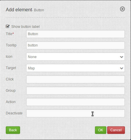
- Show label: Enable or disable text (title) next to the button.
- Title: Title of the element. The title will be listed in “Layouts” and allows to distinguish between different buttons. It will be indicated if “Show label” is activated.
- Tooltip: Text, that will be indicated if the mouse hovers over the button for a longer time.
- Icon: Symbol of the button. Based on a CSS class.
- Target: Target element (Title(ID)) of the button. The target element will be triggered by clicking on the button. (e.g.: Print).
- Click: Refers to a website or a script (e.g.: http://mapbender.org).
- Group: Adds the element to a group. Only one button of the group may be activated.
- Action: Method that is invoked when the button is activated.
- Deactivate: Method that is invoked when the button is disabled.
Icons
For some symbols you can choose between two different types of icons:
- A symbol based on a graphic (e.g. “About”),
- A symbol based on a font (e.g. “About (Font Awesome)”).
The latter are based on a IconSet, which is delivered with Mapbender as a module. We recommend to use the symbols from this library.
More information on that topic:
YAML-Definition:
title:        # title
tooltip:      # text to use as tooltip
icon: ~       # icon CSS class to use
label: true   # false/true to label the button, default is true
target: ~     # title (Id) of target element
click:        # refer to a website or script like http://mapbender.org
group: ~      # group to put the button into. Only one button per group can be active
action: ~     # method of target to call when button is activated
deactivate: ~ # method of target to call when button is deactivated
Class, Widget & Style
- Class: Mapbender\CoreBundle\Element\Button
- Widget: mapbender.mbButton (mapbender.element.button.js)
- Style: mapbender.elements.css
HTTP Callbacks
None.