Layouts
The Layouts section in the Backend of an application gives an overview of the regions (layout sections) of the application. In those regions, the elements of the application are listed. An overview of all elements is available under Elements.
Note
Different templates can have different regions: In the demo applications you can see two different region layouts. Not every element can be used in every region. Mapbender cares about that.
Layout of the Fullscreen template:
Top toolbar (region for Buttons, Links, HTML,…)
Sidepane (region for Layertree, Legend, Search, Print, HTML,…)
Map area (region for Map, Scalebar,…)
Footer (region for Copyright, Activity Indicator, Scale select,…)
Layout of the Mobile template:
Footer (region for Copyright, Activity Indicator, Scale select,…)
Map area (region for Map, Scalebar,…)
MobilePane (region for dialogs like Layertree, Legend, BaseSourceSwicther, FeatureInfo,…)
The  button located at the top right of each region allows adding elements. After pressing the button, a dialog will open, which allows for the selection of an element and its subsequent configuration.
All elements in an application can be moved between regions using drag and drop.
The regions themselves can be configured using the  button at right. There is no configuration option for region Map area and MobilePane.
The regions Top toolbar and Footer provide the following configuration options:
Configuration of the Sidepane
The Sidepane provide the following configuration options through their  button:

Type (Accordion, Buttons, Unstyled. Default: Accordion): See explanation below.
Screen type (Any, Mobile, Desktop. Default Any): The region will not be displayed when other screen types are used. Any - will always show the region.
Width (in px) (in px. Default: 350px): Width of the Sidepane in Pixels.
Resizable (Default: true): Allows to resize the width of the sidepane.
Position (Left, Right. Default: Left): Defines the placement of the sidepane.
Initially closed (Default: disabled): Defines whether the Sidepane should be closed or open on start of the application.
The option Type adjusts the inserted elements:
Accordionshows elements via tabs.Buttonsshows elements via buttons.Unstyleddoes not contain any styling options at all and displays the elements in the configured Backend order.
The option Resizable uses a minimum size of 120 px and a maximum of 95 % of the screen’s width. These values can be further restricted by using custom css:
.sidePane.resizable {
  min-width: 200px;
  max-width: 500px;
}
YAML Configuration
This template can be used to configure the properties of the sidepane in a YAML application:
- name: sidepane
  properties:
    name: accordion # tabs (for button) / accordion / NULL (for unstyled)
    align: right # right/left
    closed: false # true/false
    screenType: all # all/desktop/mobile
    width: "654px"

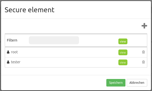
 button opens a Secure element window that allows the configuration of the View right for users/groups.
