FeatureInfo
This element provides feature info capabilities to Mapbender. It works with WMS.
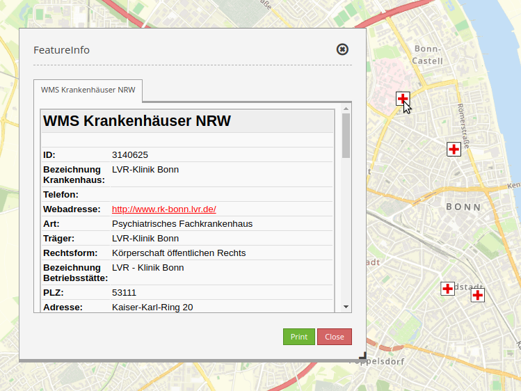
As an example serves the WMS ‘Krankenhäuser NRW’ (http://www.wms.nrw.de/wms/krankenhaus?) from ‘Ministerium für Gesundheit, Emanzipation, Pflege und Alter NRW’.
Configuration
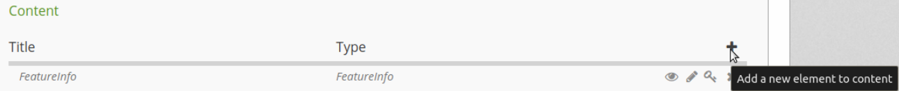
The element FeatureInfo will be integrated in the ‘content’:
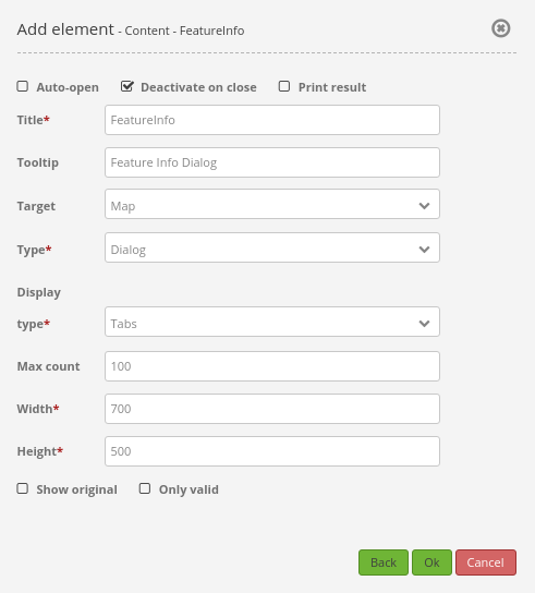
Auto-open: Enable or disable autoopening of the copyright window when starting the application (default: false).
Deactivate on close: True/false to deactivate the functionality after closing the result dialog.
Print Result: Offer a link to print the result of FeatureInfo (default: false).
Title: Title of the element. It will be indicated next to the button.
Target: ID of Map element to query.
Type: Type of the information, Element or Dialog (default and mandatory: Dialog).
Display type: Display of the information, tabs or accordion.
Max count: Maximum number of results that should be displayed in the result dialog.
Width/Height: Width/height of the dialog in px.
Show original: Show the CSS-style of the original feature info result (default: true).
Tooltip: Text used as a tooltip. It will be indicated when hovering with the mouse cursor over the button. It also used as a header in the copyright window.
A button is also needed. Further information on how to configurate a button: Button.
Layer tree settings
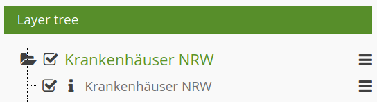
The Layer “Krankenhäuser NRW” is visible and the FeatureInfo request for the layer is activated.
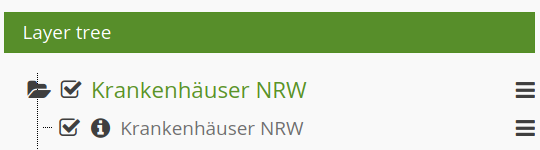
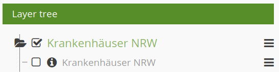
The Layer “Krankenhäuser NRW” is visible and the FeatureInfo request for the layer is deactivated.
The Layer “Krankenhäuser NRW” is invisible and there will be no FeatureInfo request (even if the FeatureInfo request is activated).
The FeatureInfo can be requested even though the layer is invisible.
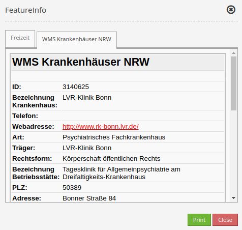
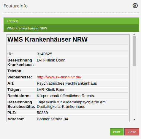
Display as original and styled
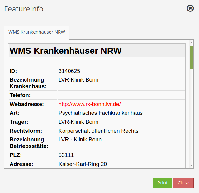
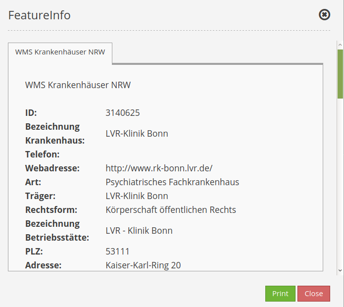
With the option “Show original”, the original design of the FeatureInfo response is used. If the option is deactivated, Mapbender tries to achieve a uniform representation.
Beispiel Original:
Beispiel gestyled:
Display as tabs and accordion
With the switch “type”, the responses of multiple services can be displayed either in different tabs or in an accordion.
Example Tabs:
Example Accordion:
Printing the results
The switch “Print result” allows you to print the output of the FeatureInfo. A “Print” button will appear on the FeatureInfo dialogue. The printing is done with the printing dialogue of the web browser.
To make sure that all images and background colors are available in your printout, you should check the printing settings of your web browser: In Firefox, you can check the option “Print background”. In Chrome-based browsers the option is called “Background graphics”. The used fonts can vary on a printout as PDF and depend on the specific viewer. Furthermore, most web browsers modify the pages a bit before printing to save ink/toner.
YAML-Definition:
title: FeaureInfo       # Titel des Elements
tooltip: Feature Info   # text to use as tooltip
type: dialog            # Default: dialog.
target: map             # Id of Map element to query
autoActivate: false     # true/false open when application is started, default: false
deactivateOnClose: true # true/false to deactivate the functionality after closing the result dialog, default is true
onlyValid: null         # require correct HTML format of response, default: false
printResult: false      # offer a link to print the result of the featureInfo, default: false
showOriginal: false     # show the css-style of the original feature info result, default: false
displayType: tabs       # tabs/accordion Default: tabs
width: 700              # width of the dialog in pixels, default is 700
height: 500             # height of the dialog in pixels, default is 500
Class, Widget & Style
Class: Mapbender\CoreBundle\Element\FeatureInfo
Widget: mapbender.element.featureInfo.js
Style: mapbender.elements.css