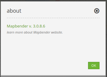
About Dialog
This element renders a button which shows a simple about dialog, listing Mapbender’s version. For the default-template the button can be placed, as usual, into the toolbar but can also be positioned into the footer region.

Configuration

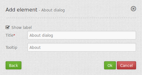
Show Label: Enable/Disable about dialog text next to the icon.
Title: Text indicated next to the about dialog icon.
Tooltip: Text to use as a tooltip. Appears when hovering over the icon.
YAML-Definition:
title: 'About Mapbender'    # text indicated next to the about dialog icon.
tooltip: 'About Mapbender'  # text to use as tooltip
label: true                  # false/true to label the button, default is true
icon: 'icon-about'           # icon to display on button
Class, Widget & Style
Class: Mapbender\CoreBundle\Element\AboutDialog
Widget: mapbender.mbAboutDialog
Style: mapbender.elements.css