Responsive Design
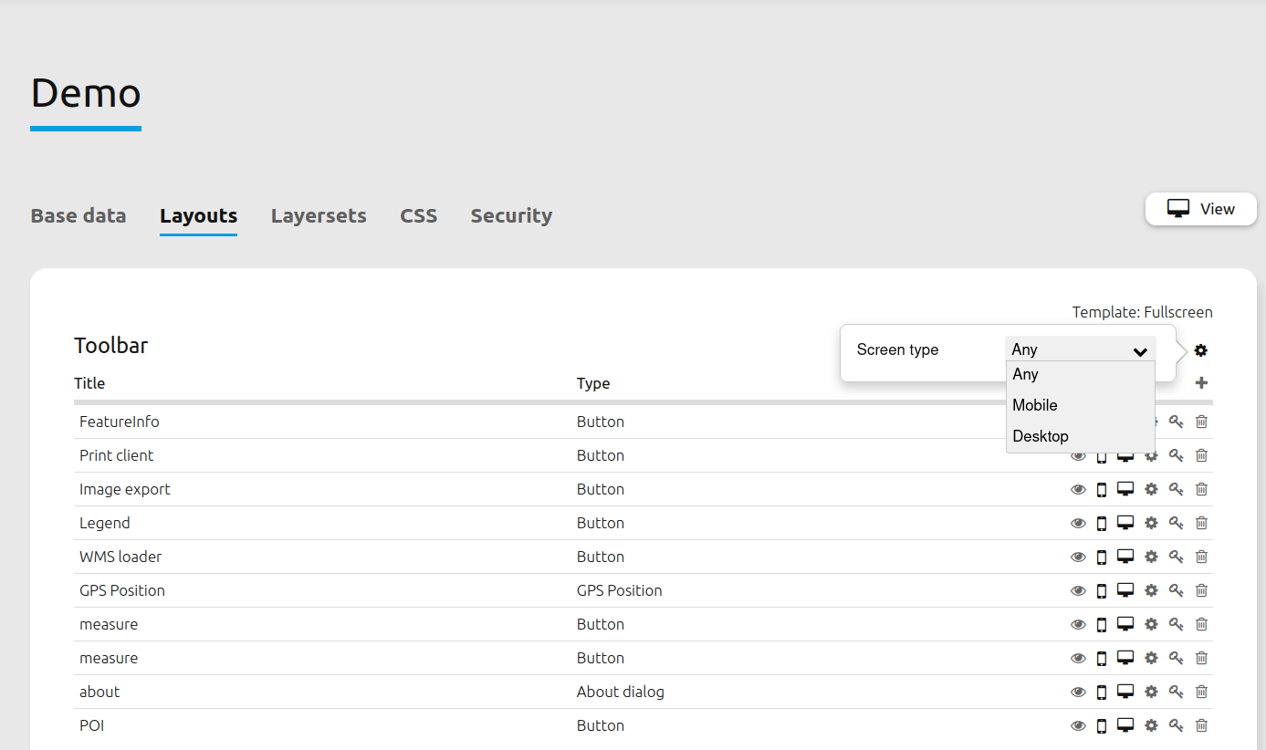
Mapbender offers a responsive design for greater usability. Every element in the toolbar and sidepane can be individually configured to appear for desktop and/or mobile resolutions.
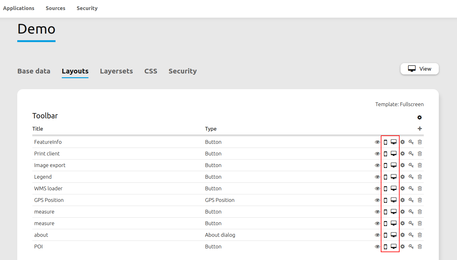
It is also possible to define templates for whole layout sections. This way, all associated elements will be automatically invisible when entering the respective view mode.
Example
In the following example, the FeatureInfo element is removed from the mobile view.
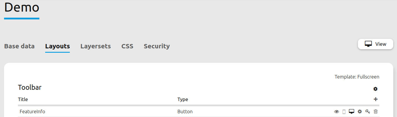
The desktop view still displays the element in the toolbar.
However, the element is no longer visible in the mobile view.