Mapbender Templates
A Mapbender Template determines the basic representation (colour, font etc.) of an application. Furthermore, it defines the sections (e.g. toolbar or sidepane) in which new elements can be added.
There are three application templates in Mapbender that come with the installation:
Fullscreen Template
Basic Template (Fullscreen without Sidepane)
Mobile Template
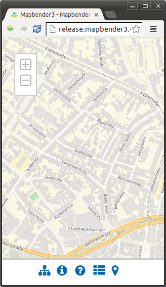
Fullscreen Template
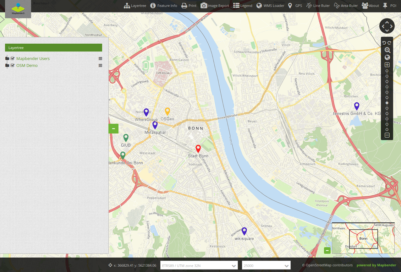
View a demo of the Mapbender Fullscreen Template https://demo.mapbender.org/application/mapbender_user_yml
Regions of the Fullscreen Template:
Toolbar (button region)
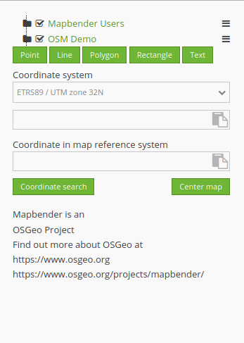
Sidepane (layertree, legend, search,…)
Content (map, navigation toolbar, scalebar,…)
Footer (impressum, scaledisplay, …)
Specials:
dark background style of the template
fullscreen display with adjustable sidepane:
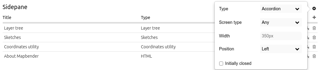
Configuration of the sidepane
The fullscreen template offers an adjustable sidepane. The sidepane style can be changed via Mapbender backend (in the sidepane section of the Layouts tab). The gear symbol in the sidepane section shows the following options:
Type
Screen type (mandatory field)
Width
Position
Checkbox “Initially closed”
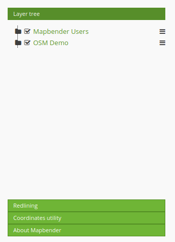
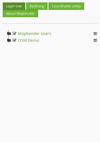
The option “Type” adjusts the inserted elements:
“Accordion” shows elements via tabs:
“Buttons” shows elements via buttons:
“Unstyled” does not contain any styling options at all and displays the elements in the configured backend order:
The option “Screen type” is a mandatory field and defines the device on which the sidepane is visible (any, mobile or desktop).
The option “Width” takes a pixel value and adjusts the sidepane width accordingly.
“Position” defines the placement of the sidepane: “Left” or “Right” can be selected.
The checkbox “Initially closed” hides the sidepane after the application is opened for the first time. It is possible to show or re-hide the sidepane while using the application.
Mobile Template
View a demo of the Mapbender Mobile Template https://demo.mapbender.org/application/mapbender_mobile_yml
Regions of the mobile Template
footer (button region)
Content (map, navigation toolbar)
Mobilepane (area that will overlapp the map, when a dialog like Layertree, FeatureInfo is displayed)
Please note that not all elements can be used with the Mobile template at the moment. Here is a list of the elements that can be used:
Map
GPS-Position
Layertree (different design, will only show the root layer title of a service, you can only de-/activate a whole service)
BaseSourceSwitcher (different design: list not buttons)
FeatureInfo
Navigation Toolbar (Zoombar)
HTML
Button
SimpleSearch