1. Search Router
This element creates a configurable search formular with a configurable result output in which generic SQL search is supported.
1.1. Configuration
Note
The SearchRouter needs access to the database where the search tables are. You have to define a new database configuration to be able to connect with the geo database. Read more about this at YAML Configuration (Configuration and Application files).
The element may be integrated into the sidepane or via a button into from the toolbar. To configure a button visit the documentation at Button.
Title: Title of the element. The title will be listed in the Layouts section in the backend. It is shown as sidepane tab/button title (usage in sidepane) or dialog title (usage via button).
Width: Width of the dialog (only for dialog, not sidepane)
Height: Height of the dialog (only for dialog, not sidepane)
You can define Searches (Routes) with the + Button. Each Search has a title which will show up in the search form in a selectbox. The definition of the search is done in YAML syntax in the textarea configuration.
Routes: Collection of search routes.
Title: Search Title (appears, when a search is added to Routes by using +)
Configuration: Field to configure the search
(appears, when a search is added to Routes by using +)
1.1.1. Route Configuration
In the textarea configuration you define all important information for each search.
the database connection
the search tables/views and columns
the design of the form
and the design of the result table
the design of the results on the map
class: Mapbender\CoreBundle\Component\SQLSearchEngine
class_options:
    connection: geodata_db   # database alias from config.yml
    relation: polygons       # search table
    attributes:              # columns that are used in the form and in the result table
      - gid
      - name
      - type
      - city
    geometry_attribute: geom # reference to the geometry column
form:
    name:
        type: Symfony\Component\Form\Extension\Core\Type\TextType
        options:
            required: true
        compare: exact
    city:
        type: Symfony\Component\Form\Extension\Core\Type\TextType
        options:
            required: false
            label: City/Town
        compare: ilike
results:
    view: table
    count: true
    headers:
        gid: ID
        name: Name
        city: City/Town
    callback:
        event: click
        options:
            buffer: 10
            minScale: null
            maxScale: null
1.1.2. Class and Class options
The configuration starts with the definition of the class (always class: MapbenderCoreBundleComponentSQLSearchEngine) followed by the information about the database connection, definition of the search table, the columns that are used and the geometry column.
1.1.3. Form
In the form section you can define the setup of the form and define textfields and selectboxes.
You refer to the table columns and define the type, options and compare.
1.1.4. Type
The form supports two types - text and choice.
You have to define a configuration for each table column you would like to provide in the search form. The configuraton starts with the column name (in the example it is the column called name).
label - you can define a label parameter (if not defined the capitalized column name will be used).
required: You can define whether a type should be required (default is false). With required: true a mandatory field is defined. That means that the user has to define a search term here before the search can run. Headings of required fields are marked with a red ‘*’.
You also can define a compare mode. See section ‘comparison mode’.
1.1.4.1. Type text
Type text allows you to provide text fields for your search formular.
Type text supports autocomplete. If you want to add autocomplete to the field you have to add the additional attr-parameters.
Supported autocomplete paramters are:
data-autocomplete: on - parameter to activate autocomplete
data-autocomplete-distinct: on - paramter to activate distinct autocomplete
data-autocomplete-using: column1, column2 - define other column/s that should be also considered on autocomplete
Type text; example with autocomplete:
form:
    name:
        type: Symfony\Component\Form\Extension\Core\Type\TextType                                                      # input box for text
        options:
            label: Name
            required: true
        attr:
            data-autocomplete: 'on'          # activate autocomplete
            data-autocomplete-distinct: 'on' # only show equal results once
            data-autocomplete-using: type, city     # autocomplete, list of input fields (with comma seperated), WHERE input
        compare: exact
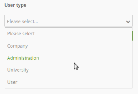
1.1.4.2. Type choice
Type choice allows you to provide a selectbox in your search formular.
For type choice you can define a placeholder. This is a text that is shown before an option is selected.
You have to define the choices for the selectbox. You define a value and a key.
key - will be send in the search query
value - is show as text in selectbox
..note: Please note that from Mapbender 3.2 you should use the value: key definition and type: SymfonyComponentFormExtensionCoreTypeChoiceType
Type choice; example with different selection options via dropdown:
type:
    type: Symfony\Component\Form\Extension\Core\Type\ChoiceType                                                      # box with selection options as dropdown list
    options:
        label: User type
        required: false
        placeholder: 'Please select...'
        choices:
            Company: A
            Administration: B
            University: C
            User: D
            Something else: E
    compare: exact
1.1.5. Comparison Mode
For every field a comparison mode can be set. This is used by the engine when the query is sent.
The following comparison modes are supported:
exact: exact comparison (key = val)
iexact: comparison ignoring cases (case-insensitive)
like: Standard, both-side ‘like’
like-left: left-hand ‘like’
like-right: right-hand ‘like’
ilike: both-side ‘like’, (case-insensitive - *searchstring*)
ilike-left: left-side ‘like’ (case-insensitive - *searchstring)
ilike-right: right-side ‘like’ (case-insensitive - searchstring*)
1.1.6. Result
In the section results the definition for the result table and styling is none.
results:
    view: table
    count: true
    headers:
        gid: ID
        name: Name
        city: City/Town
    callback:
        event: click
        options:
            buffer: 10
            minScale: null
            maxScale: null
view: is always set to table. No more options are possible
count: true or false to show the number of results
headers: definition of the columns to display and the alternative labeling
callback: define the action for the click event on a result item
event: only click is supported
buffer: zoom to the result item with a defined buffer
minScale and maxScale: zoom to the result item in a scale between minScale and maxScale
1.1.7. Styling the Results
By default the results are shown in the default-OpenLayers Style.
You can overwrite this by handing over a styleMap-Configuration.
Three different styles are configured:
default: default style
select: style on select
temporary: style on mouse-over
results:
    [...]
    styleMap:
        default:
            strokeColor: '#00ff00'  # border color
            strokeOpacity: 1        # border opacity (1 - opaque / no transparency)
            strokeWidth: 3          # border width
            fillColor: '#f0f0f0'    # fill color
            fillOpacity: 0          # fill opacity, (0 full transparency)
            pointRadius: 6          # size of the point symbol
        select:
            strokeColor: '#0000ff'
            strokeOpacity: 1
            strokeWidth: 4
            fillColor: '#ff00ff'
            fillOpacity: 0.8
            pointRadius: 10
        temporary:
           strokeColor: '#0000ff'
           fillColor: '#0000ff'
           fillOpacity: 1
In the default style the point-symbol interior is transparent (fillOpacity: 0). Only their outlines will be drawn in green.
The selected features will be drawn with a purple fill and an opacity of 0.8. The outline of the symbol is blue.
The temporary symbols on mouse-hover are blue points.
The styleMap settings override the default settings, so you only have to define the sections you want to overwrite. No extra styleMap is set the default style will be used.
Note, that the hexadeximal color values have to be stated in quotation marks, because # would be interpreted as a comment instead.
1.2. Configuration Examples
1.2.1. 1. Example
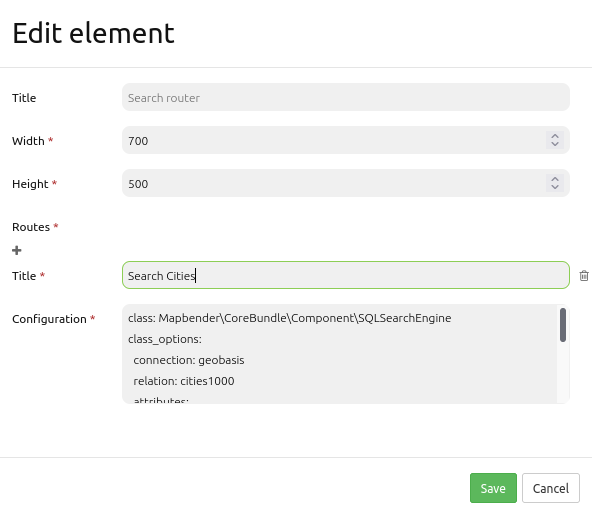
In this example a search was configured for the Mapbender user and added into the sidepane, usable under the + in Layouts.
The confguration dialouge for this example looks like this:
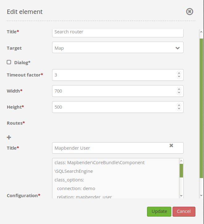
The element title (Title) is Search. It is again displayed as a title in the sidepane. The checkbox is unchecked, because the element is implemented into the sidepane and not as a button. The Timeout factor is set to 2. The fields Width and Height are filled, but they won’t be used in this application, because the element is configured in the sidepane. It is implemented via the + -Symbol and Routes into the search, called (Title) Mapbender User. The yaml-Configuration of the Element is written in Configuration. In Completion it reads:
class: Mapbender\CoreBundle\Component\SQLSearchEngine
class_options:
  connection: geodata_db                 # database (on which the element has access)
  relation: mapbender_user               # table (on which the element has access)
  attributes:                            # table columns (which the element addresses)
    - gid
    - orga
    - town
    - usertype
  geometry_attribute: the_geom           # definition of the geometry column
form:                                    # configuration of the form
  orga:                                  # search field (e.g. search for specific Mapbender User)
    type: Symfony\Component\Form\Extension\Core\Type\TextType
    options:
      required: false                    # no mandatory field
      label: 'Mapbender User'            # caption of the search field
      attr:                              # additional definable attributes
        data-autocomplete: 'on'          # auto-completion of search words
        data-autocomplete-distinct: 'on'
    compare: ilike                       # see section 'comparison mode' on this page
  town:                                  # search field (e.g. search for specific city)
    type: Symfony\Component\Form\Extension\Core\Type\TextType
    options:
      required: false                    # no mandatory field
      label: City                        # caption of the search field
      attr:
        data-autocomplete: 'on'
        data-autocomplete-distinct: 'on'
    compare: ilike
  usertype:                              # search field (search for specific User type)
    type: Symfony\Component\Form\Extension\Core\Type\ChoiceType
    options:
      placeholder: 'Please select...'    # displayed text in field before entering a search
      choices:                           # choices need to have the following format: "entry in the database column": "displayed name in the drop down list"
        1: Company
        2: Administration
        3: University
        4: User
      required: false                    # no mandatory field
      label: User type                   # caption of the search field
    compare: exact                       # see section 'comparison mode' on this page
results:                                 # configuration of the shown results list
  view: table                            # display results as table
  count: true                            # show number of results
  headers:                               # column title; format: column title in the database: column title shown in the table
    gid: ID
    orga: 'Mapbender User'
    town: City
  callback:
    event: click
    options:
      buffer: 10
      minScale: null
      maxScale: 10000
  styleMap:                              # Styling points on the map
    default:                             # Styling of all points on the map
      strokeColor: '#003366'
      strokeOpacity: 1
      fillColor: '#3366cc'
      fillOpacity: 0.5
    select:                              # Styling of the selected point on the map
      strokeColor: '#330000'
      strokeOpacity: 1
      fillColor: '#800000'
      fillOpacity: 0.5
    temporary:
      strokeColor: '#0000ff'
      fillColor: '#0000ff'
      fillOpacity: 1
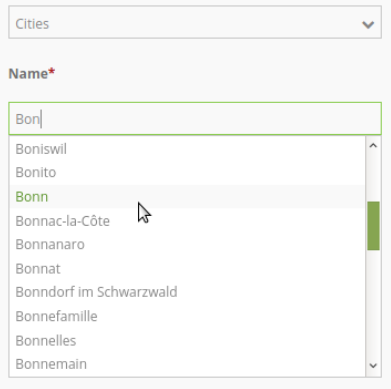
This picture illustrates which consequences the configurations in the yaml-definition have for the search formula:
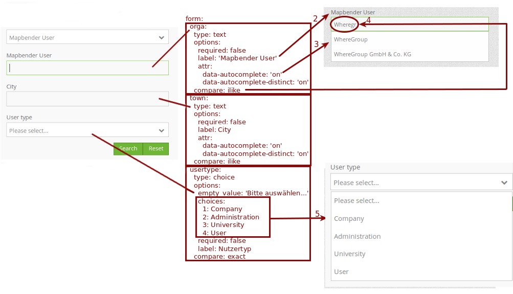
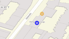
Displayed is the excerpt of the yaml-definition configuring the formula. Columns orga, town and usertype are used in the formula and implemented as the fields Mapebender User, Town and Usertype. Mapbender User and Town are type text, Usertype can be of various types. The text that should be displayed here, if nothing is selected yet, is “Please select…” (Nr. 1 – placeholder: ‚Please select…‘). The title above these fields is set with a label (Nr. 2). The attribute data-autocomplete: ‚on‘ results in a dropdown menu with recommendations from the database (Nr. 3). Because compare: ilike is enabled it is not necessary to write the exact word. The search will find results that are only similar to the written term (Nr. 4 – Wheregr (the g is lowercase, nevertheless WhereGroup with uppercase G was found). The fieldtype choice is variable, possibilities are defined in choices (Nr. 5). The table contains the possibilities as numbers (1, 2, 3, 4). In this example every number represents a text, which should be displayed in the dropdown menu.
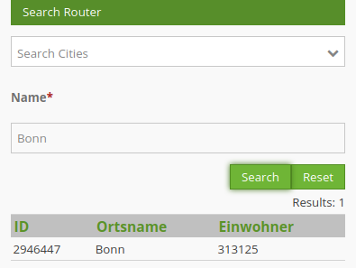
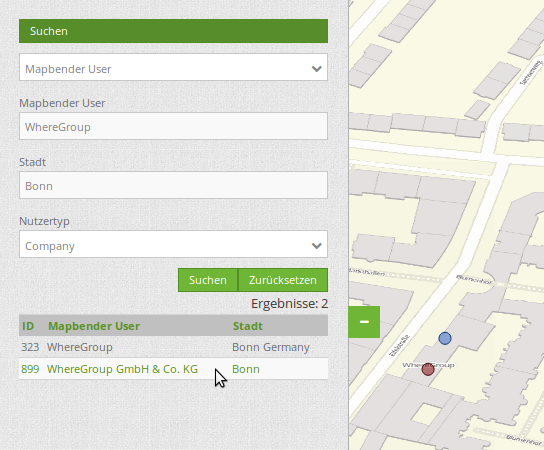
A complete search for the Mapbender User WhereGroup, in the Town Bonn, of the Usertype Company and the found results will look like this:
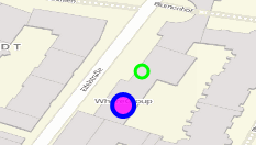
This picture illustrates the consequences our configuration of the yaml-defnition had on the display of the results.
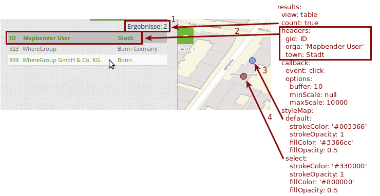
Here only the configuration of the results is shown. The number of results is shown because count: true (Nr. 1) is enabled. The titles of the columns are defined in headeers (Nr. 2). Here the name of the column is mentioned first, to define which results are referenced. After the colon we set the title which will be displayed in the application. In the block styleMap the points are styled. The block default (Nr. 3) references all points, and the block select (Nr. 4) only selected points.
Because none of these fields are mandatory the search will work wih only on field.
1.2.2. 2. Example
The following example uses the german geographical names data in 1:250.000 from the Bundesamt für Kartographie und Geodäsie. The data was extracted to gn250_p table in the gisdb database and can be used for the search. The data has some specific columns:
id: the id of the dataset
name: the name of the dataset
kreis: the administrative county (not for every dataset)
oba_wert: the type of data (e.g. station, museum, etc.)
Example of a route-configuration in the configuration area:
class: Mapbender\CoreBundle\Component\SQLSearchEngine
class_options:
  connection: geodata_db
  relation: gn250_p
  attributes:
    - id
    - name
    - kreis
    - oba_wert
  geometry_attribute: geom
form:
  name:
    type: Symfony\Component\Form\Extension\Core\Type\TextType
    options:
      required: true
    compare: ilike
results:
  view: table
  count: true
  headers:
    id: ID
    name: Name
    kreis: Landkreis
    oba_wert: Art
  callback:
    event: click
    options:
      buffer: 10
      minScale: null
      maxScale: null
1.2.3. YAML-Definition
In the mapbender.yml file:
target: map                                               # ID map element
asDialog: true                                            # true: results in dialog box
timeoutFactor:  3                                         # timeout factor (multiplied by autocomplete deceleration) to prevent autocorrect after a search has been started
height: 500                                               # height of dialog
width: 700                                                # width of dialog
routes:                                                   # collection of search routes
    demo_polygon:                                         # machine-readable name
   class: Mapbender\CoreBundle\Component\SQLSearchEngine  # path to used search engine
   class_options:                                         # options passed to the search engine
       connection: geodata_db                             # search_db, DBAL connection name, ~ for default
       relation: polygons
       attributes:
           - gid                                          # list of columns, expressions are possible
           - name
           - type
           - city
       geometry_attribute: geom                           # name of the geometry column, attention: projection needs to match with the projection of the map element
   form:                                                  # declaration of the search form
       name:                                              # field name, column name
           type: Symfony\Component\Form\Extension\Core\Type\TextType        # input field, normally text or numbers
           options:                                       # declaration of the input field
               required: false                            # HTML5, required attributes
               label: Name                                # custom label, otherwise field name used
               attr:                                      # HTML5, required attributes
                   data-autocomplete: on                  # attribute to activate autocomplete
                   data-autocomplete-distinct: on         # attribute to activate distinct autocomplete
                   data-autocomplete-using: type          # autocomplete, list of input fields (with comma seperated), WHERE input
           compare: ilike                                 # see section 'comparison mode' on this page
       city:
           type: Symfony\Component\Form\Extension\Core\Type\TextType
           options:
               required: false
               label: City/Town
           compare: ilike
       type:
           type: Symfony\Component\Form\Extension\Core\Type\ChoiceType
           options:
               placeholder: Please select a type.
               required: false
               choices:
                   A Company: A
                   B Administration: B
                   C University: C
                   D User: D
                   E Something else: E
   results:
       view: table                                         # display results as table
       count: true                                         # show number of results
       headers:                                            # column title
           gid: ID                                         # column name -> header
           name: Name
           type: Type
           city: City/Town
       callback:                                           # click event
           event: click                                    # click or mouseover event
           options:
               buffer: 10                                  # buffer (before zoom)
               minScale: ~                                 # scaling boundaries for zoom, ~ for no boundaries
               maxScale: ~
       styleMap:
           default:
               strokeColor: '#00ff00'
               strokeOpacity: 1
               fillOpacity: 0
           select:
               strokeColor: '#ff0000'
               fillColor: '#ff0000'
               fillOpacity: 0.4
           temporary:
               strokeColor: '#0000ff'
               fillColor: '#0000ff'
               fillOpacity: 1