Link
The link element provides a button widget that refers a defined link like a website or script.
Configuration

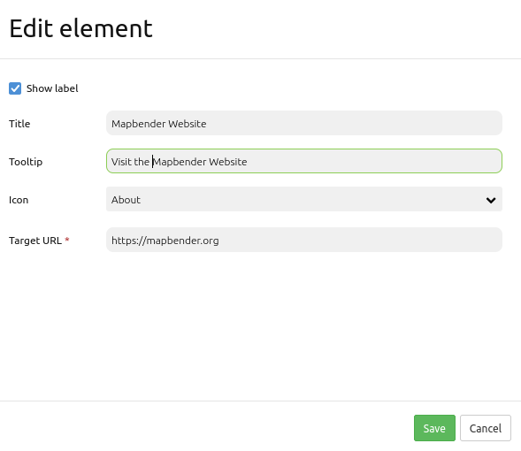
Show label: Enables or disables text (title) next to the button (Default: true).
Title: Title of the element. The title will be listed in “Layouts” and allows to distinguish between different buttons. It will be indicated if “Show label” is activated.
Tooltip: Text, that will be indicated if the mouse hovers over the button for a longer time.
Icon: Symbol of the button. Based on a CSS class.
Target URL Reference to a website or a script.
Icons
For some symbols you can choose between two different types of icons:
A symbol based on a graphic (e.g. “About”),
A symbol based on a font (e.g. “About (Font Awesome)”).
The latter are based on a IconSet, which is delivered with Mapbender as a module. We recommend to use the symbols from this library.
More information on that topic:
Example
It is possible to create and adjust different buttons with different functions. Buttons can refer to features which are included in the Content area. For example, it is possible to create a Legend button or Line- and/or Area Ruler buttons:
Link to a Webpage
First, you have to select the link element by clicking on the + - symbol in the Toolbar section in the Layouts tab.

After the selection of the link element, the “Add element - Link” dialog box opens, where you can configure the element.
You can set the name of the link button in the field Title. This title will be displayed as label next to the icon if Show label is active.
In the field Tooltip, you can define a text that will be displaced as tooltip during hovering over the button. You can choose from a variety of icons to set the icon for your link button.

YAML-Definition:
title: Link                                 # title
class: Mapbender\CoreBundle\Element\Button
tooltip: Visit the Mapbender Website        # text to use as tooltip
icon: iconInfoActive                        # icon CSS class to use
label: true                                 # false/true to label the button, default is true
click: https://mapbender.org                # refer to a website or script