HTML
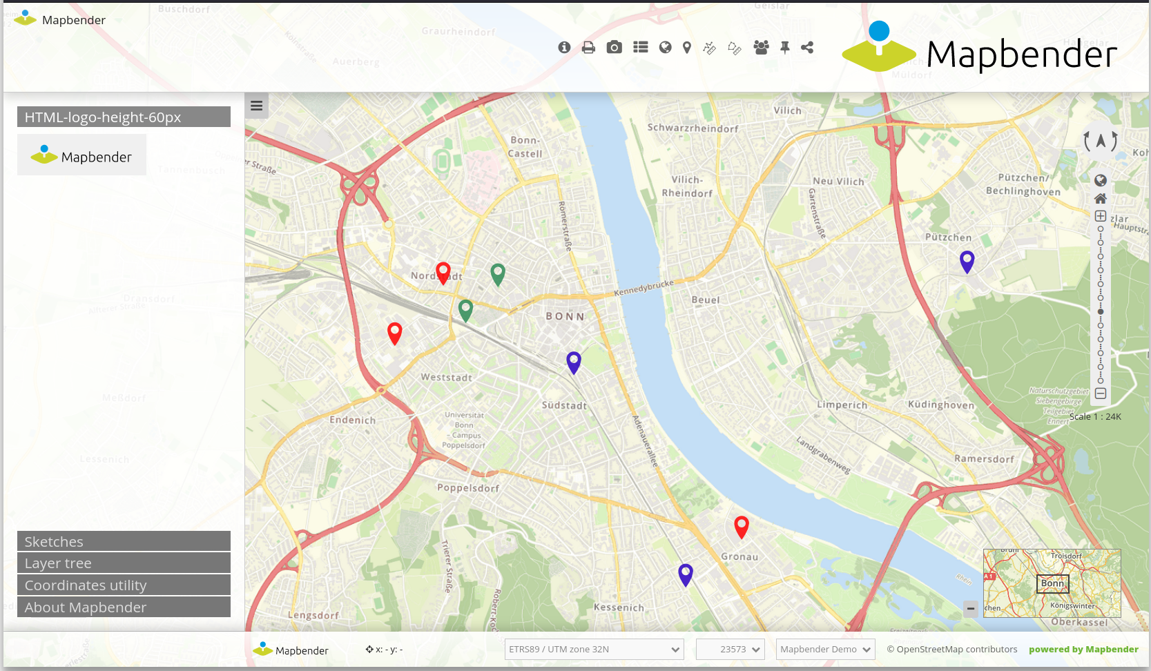
This element allows the integration of HTML anywhere in an application. Figures, links or e.g. texts can be inserted. The following illustration shows the integration of a Mapbender logo in footer, toolbar and sidepane:
The following variables can be integrated in HTML:
“application” (Entity Application)
“entity” (Entity HTML-Element)
Configuration
This element has to be integrated in the Backend.

Title: Title of the element. The title will be listed in Layouts (changeable in all 4 Regions).
Content: Content of the HTML-element. The variables “application” and “entity” are available (changeable in all 4 Regions).
Classes: You can refer to a CSS class for the HTML element. The class can be defined in the css editor (changeable in all 4 Regions).
OpenInline (boolean): If true, the html element will be displayed inline (without title and popup) when in content or toolbar region. Ignored when the element is in other regions.
AutoOpen (boolean): (only in popup mode): The popup will be opened automatically if set.
Modal (boolean): (only in popup mode): If set to true, the background will be darkened (previously the default behaviour for the copyright element; will be set automatically for existing copyright elements).
PopupWidth (int): (only in popup mode): popup width in pixels.
PopupHeight (int): (only in popup mode): popup height in pixels.
DontShowAgain (boolean): (only in popup mode and only when autoOpen is true): If set to true, a checkbox will be shown to the user. If ticked, autoOpen is disabled until the content changes.
DontShowAgainLabel (string): (only in popup mode): Label for the dontShowAgain checkbox.
Element Symbol: (only in Sidepane): The symbol of the element. The symbol is displayed in the Sidepane and can be used to open the Element.
Warning
Depending on where the Element is integrated, the content of what can be changed may vary. For example, if the element is integrated in the sidepane, only the title, content, class, inline and element symbol can be changed.
Configuration examples
OpenInline
OpenInline allows you to display the HTML content permanently. This can be explicitly enabled on the map (e.g., copyright notice) or in the sidepane.
Modal Mode and do not show again option
The HTML element can be used in modal mode. No other interaction is possible when the dialog opens.
The “Don’t show again” option can be activated. The dialog will only be displayed again when the text changes.
Insert picture
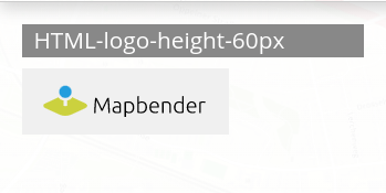
In this example, the Mapbender Logo was integrated in the sidepane. It can be adjusted with a predefined height, background color and transparency as well as a certain padding.
<img src='https://mapbender.org/fileadmin/mapbender/resources/images/logos/Mapbender-Logo.svg'
height='60px' style='background-color:rgb(240, 240, 240, 0.9); padding:10px'>
Insert picture with link:
A linkage was added to the previously inserted logo. It references to the Mapbender website (href='https://mapbender.org') if the logo is clicked on. The link is opened in a new tab because of target='_blank'.
<a href='https://mapbender.org' target='_blank'>
<img src='https://mapbender.org/fileadmin/mapbender/resources/images/logos/Mapbender-Logo.svg'
height='60px' style='background-color:rgb(240, 240, 240, 0.9); padding:10px'></a>
Variables & HTML-Element
Several variables can be integrated in the HTML-Element.
Variable: “application.title”
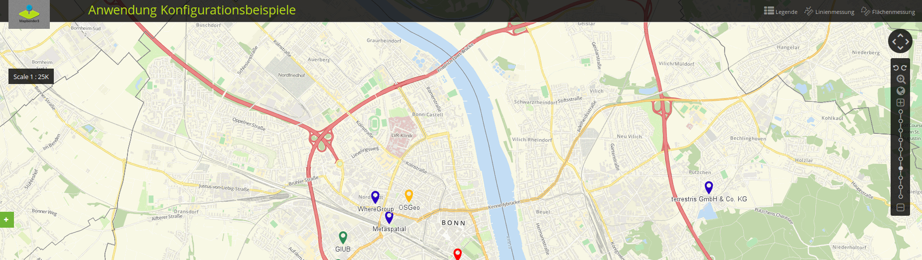
This variable allows the integration of the application title. In the example, this corresponds to “Konfigurationsbeispiele”.
The HTML-Code could look like this:
<b><span style="font-size:25px;color:#b6dd18;margin-right:50vw"> Anwendung {{ application.title }} </span></b>
The application title is defined through {{ application.title }}. The term “Anwendung” is an addition and will display independently from the actual title. The style-block defines font size, font width, font color as well as position of the title.
The result for the configuration example looks like this:
Variable: app.user.username
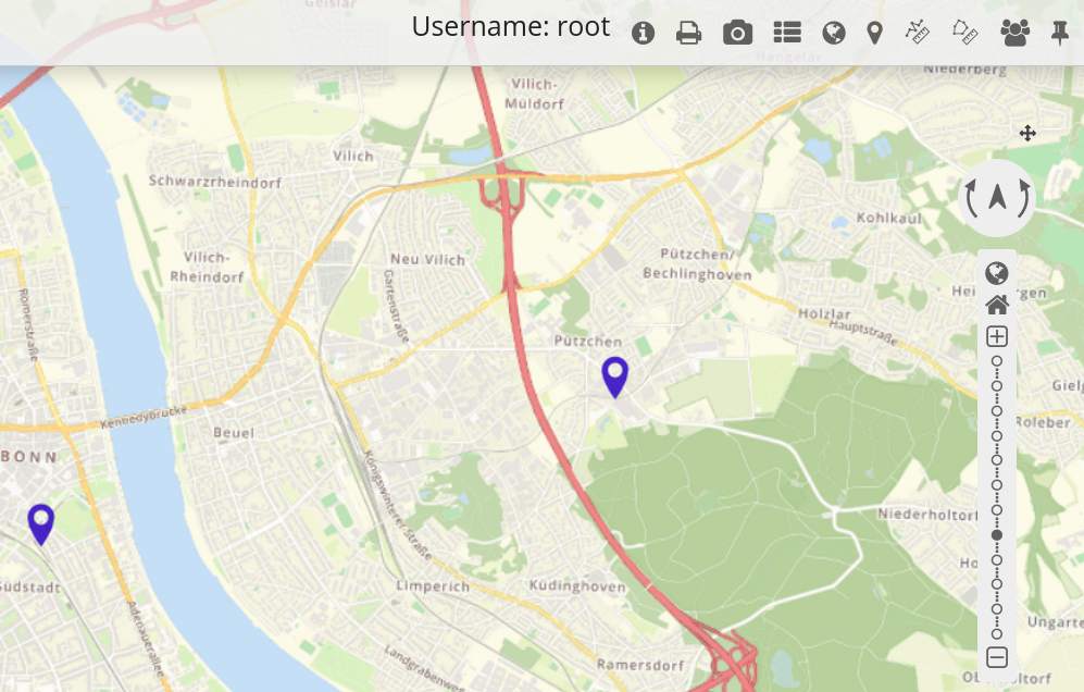
This variable displays the name of the active user:
<p>Username: {{ app.user.username }}</p>
In this example, the user name is displayed in the toolbar:
Variable: group.title
The group of a user cannot be defined in a single expression, because Twig only supports the map-filter in higher versions. In order to integrate this variable, a loop will be used:
{% for index, group in app.user.groups %}
    <p>Group #{{ index }}: {{ group.title }}</p>
{% endfor %}
With this configuration, index and group name are displayed in the toolbar.
Variable: “entity”
The variable { entity } displays the ID and { entity.title }, which displays the title of the HTML-element.
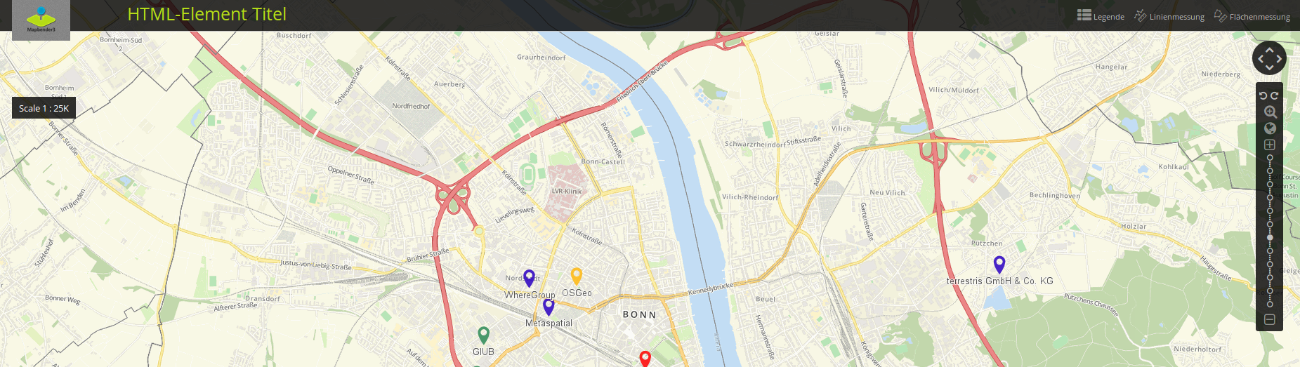
In the following, the variable { entity.title } was integrated with the text addition “HTML-Element”. The Styling parameters correspond to those of the example with application.title. Text additions, variables and position were simply adjusted for entity.title.
<b><span style=“font-size:25px;color:#b6dd18;margin-right:60vw“> HTML-Element
{{ entity.title }} </span></b>
These variables could look as follows:
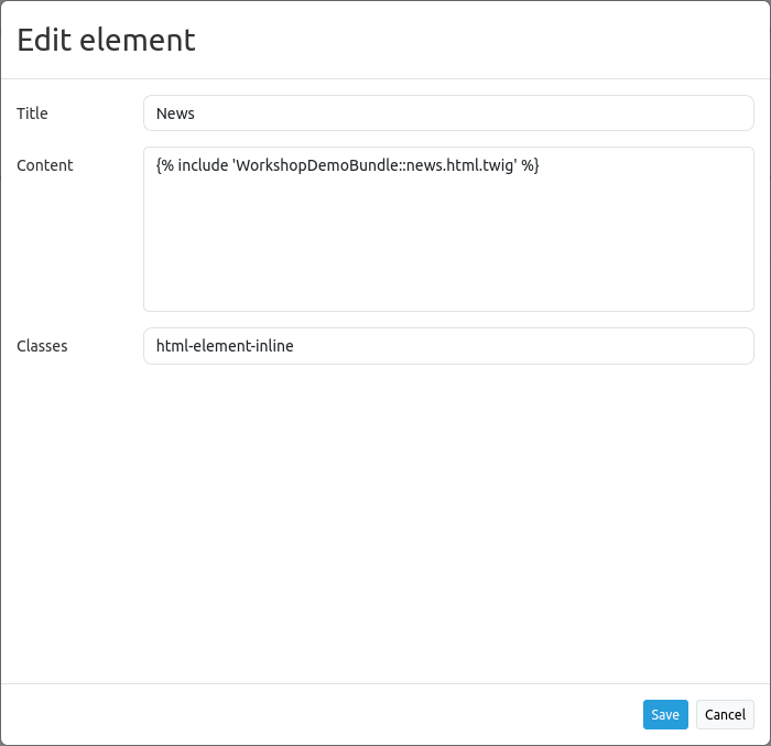
Refer to a twig file
You can refer to a twig file in the Content area. Please note that the twig file has to contain valid HTML.
YAML-Definition
This template can be used to insert the element into a YAML application.
title: 'HTML-Element'
class: Mapbender\CoreBundle\Element\HTMLElement
content: <p>Hello, World!</p><p>Application: {{ application.title |trans }}</p> # The variables "application" and "entity" are available.
classes: my-special-css-class