Legend
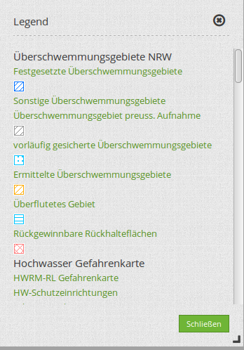
The legend object shows a legend of the layers that are displayed in the map. Every single layer is listed which includes point, line and/or polygon objects.
Configuration
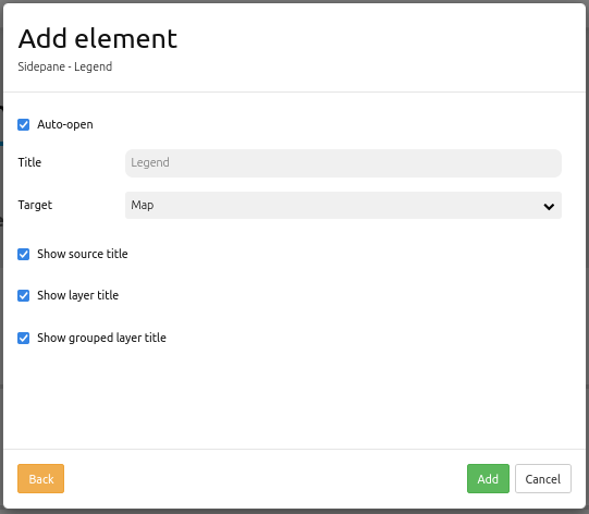
Auto-open: If activated, the legend opens when the application is started. Default is active.
Title: Title of the element. The title will be listed in “Layouts”. Is also shown next to the button, if “Show layer title” is activated.
Target: ID of Map element to query.
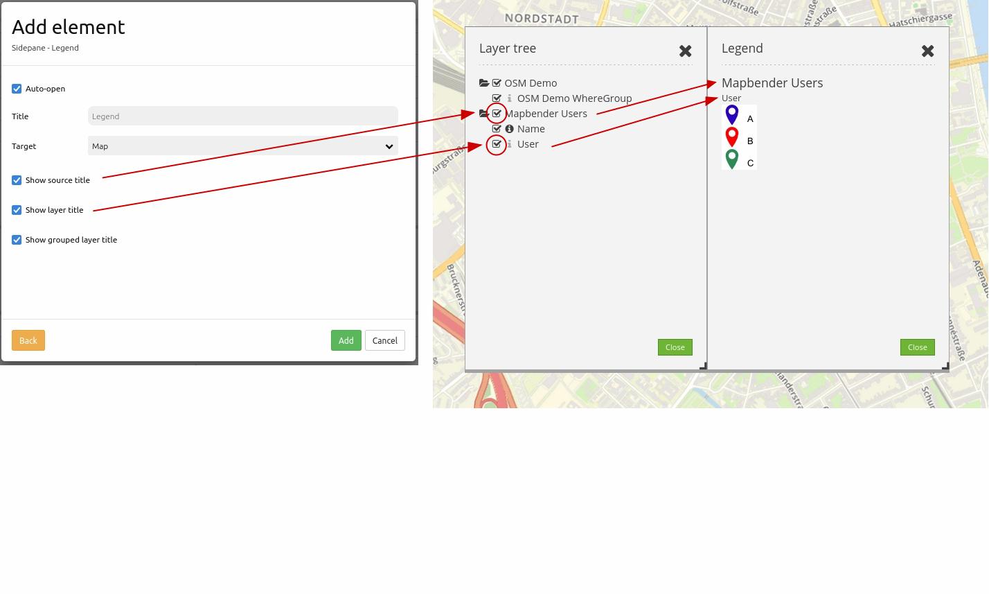
Show source title: shows WMS/source title, default is true.
Show layer title: shows layer title, default is true.
Show grouped layer title: shows group title for grouped layers, default is true.
The Legend element is integrated via a button or in the sidepane. If you look for configurational details for the button, head over to this page: Button.
Configuration Examples:
Legend in the Sidepane:
If yout want to integrate a legend in the sidepane, click the + -button in the “Layouts”-tab (section “Sidepane”).

Then, choose the element “Legend” in the appearing window. The configurational dialog “Add element – Legend” will open.
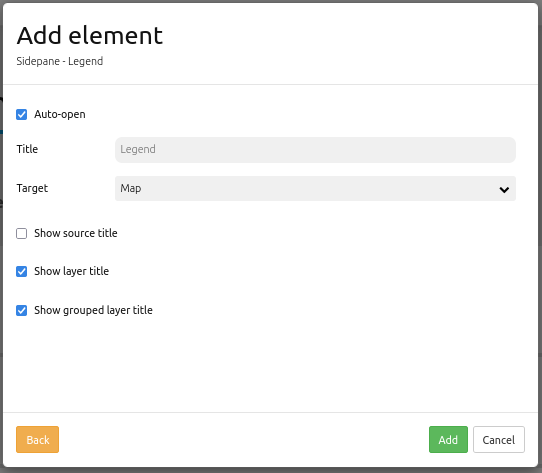
Our configured element has the title “Legend”. Target is set to “Map”. The legends opens automatically (set checkbox Auto-open). Moreover, the layer title and the title of all grouped layers appears (set checkboxes Show layer title and Show grouped layer title).
Given this configuration, the result looks like this:
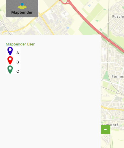
The legend will be set as “blockelement” in the sidepane now. If the legend shall be integrated into the toolbar, it is recommended to include it over a button and not over the element button (see next chapter).
Legend in the toolbar:
The legend element can be integrated with a button in the toolbar. First step: Integrate the legend element. Open the application backend and add the element into the content section of the Layout-tab.

In this example, the following settings are chosen:
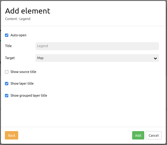
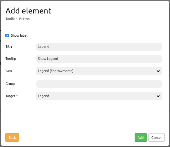
In our example, the checkbox Auto-open is dismissed. Therefore, the legend opens only with a click on a button. This button has to be implemented into the toolbar section. For detailed instructions on buttons, see the Mapbender-Documentation page Button.
The configuration of a button can look like this:
Following the above instructions, the result in the application looks like this:
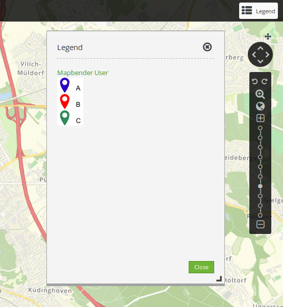
The toolbar shows the button for the legend element. If the button is clicked, the dialog with the generated legend opens.
The activation and deactivation of checkboxes in the configurational settings leads to:
YAML-Definition:
tooltip: 'Legend'                    # text to use as tooltip
elementType: dialog                  # dialog/blockelement, default is dialog
autoOpen: true                       # true/false open when application is started, default is true
displayType: list                    # accordion/list type of display, default is list
target: ~                            # Id of Map element to query
hideEmptyLayer: true                 # true/false hide when no legend is available, default is true
showWmsTitle: true                   # true/false show WMS title, default is true
showLayerTitle: true                 # true/false show layer title, default is true
showGroupedLayerTitle: true          # true/false show group title for grouped layers, default is true
You can optionally use a button to show this element. See Button for inherited configuration options. You also can define the layertree with type element. Then you can display the layertree in a frame like the sidebar.